Are you hungry for new tutorials how to make unusual advertising for your business? Then this tutorial special for you!
So, let’s start! In the beginning create new document about 500×500 pixels and fill it with linear gradient by using colors like #f0f0f0 and #c2c2c2.

After that create a new layer, then use the Elliptical Marquee Tool to create rounded selection in the middle of the canvas and after that select some appropriate colors, for example #f2f2f2 and #c9c9c9 and drag a linear gradient again.
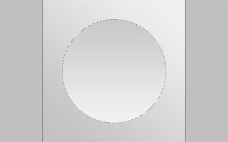
After that use Select > Modify > Feather for blurring selection borders about 1 pixel, then apply Select > Modify > Contract to reduce selected area for 3 pixels and press Ctrl+Shift+I (the same function as Select > Inverse) to invert selection. Ok, then get out the Burn Tool (Brush: 100 px, Range: Highlights, Exposure: 15%) and make bottom plate’s edge a little bit darker.
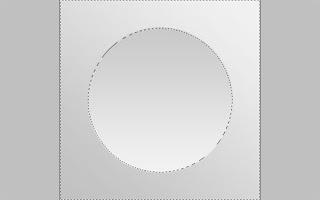
After that use the Dodge Tool (Brush: 100 px, Range: Highlights, Exposure: 20%) and make the opposite plate’s edge brighter.
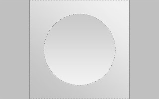
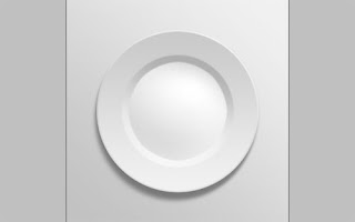
Ok, now press Ctrl+D to deselect this area. Then use the Elliptical Marquee Tool again to create one more selection again. Try to make the same selection as mine on the picture below. It should be created selected area in the middle of plate’s area.
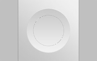
Use Select > Modify > Feather for blurring selection borders about 1 pixel again. After that select the Burn Tool with the same presets and try to make the same burn work as on my picture below:
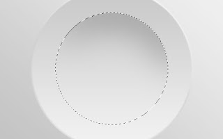
Then change Burn Tool to Dodge Tool and add brighter gradient to selected area in the bottom.
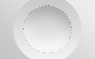
Now, use Select > Modify > Contract to contract selection about 15 pixels and apply again both of Burn Tool and Dodge Tool one more time.
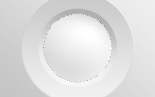
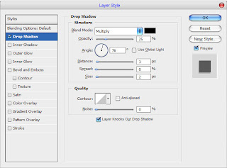
Remove selection with Ctrl+D. Looks realistic isn’t it? To finish off with creation our plate I think we should add some shadow. Apply Drop Shadow blending option to this layer.

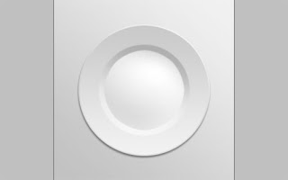
Then use Layer > Layer Style > Create Layer to separate Drop Shadow layer style from current layer. Then move to the Drop Shadow layer and deform it by using Smudge Tool (Brush: 500px, Mode: Normal, Strength: 70%).
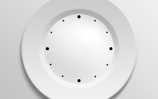
Now, move to the next step. The next thing that I planned to add is the clock-face to the plate. How we can do this? It is very easy! Move to the upper layer, because now we are located on the shadow layer under the plate. Then select the Ellipse Tool and add 4 small black circles to the plate area.

After that add 8 smallest circles with the same color.
Then I would like to add numbers. Get out the Horizontal Type Tool and write out the numbers from 1 to 12 under each circle.
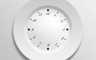
I used Bickham Script Pro as my font choice. Actually, this font is commercial. Feel free to try a different font, or you know, buy or ‘get’ a nice font from somewhere. Ok, move to the next step. Now we need to add clock hands to our plate-clock. I have one interesting idea. We can put fork and spoon instead of clock hands. Go to Google Images and try to find the pictures of fork and spoon. Also feel free to use mine picture. Open up this file and use the Polygonal Lasso Tool to separate objects from background.
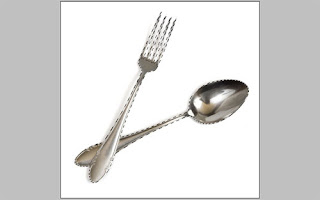
Copy selected area with Ctrl+C. Then go to main canvas again and press Ctrl+V to paste copied part of image here.
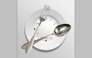
Use Edit > Free Transform to reduce current layer content and move it to the same position as on my picture below.

After that apply Drop Shadow blending option to this layer.

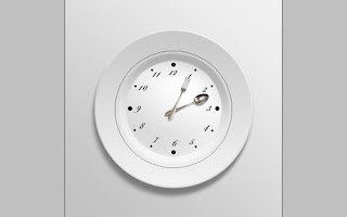
To finish off the tutorial I would like to add some text. First of all select the Ellipse Tool (you need to make sure that you’re working with Paths instead of Shape Layers) to add the same circle as you can see on my picture below:
Now you need to type text across the circle line. Use the Horizontal Type Tool again for typing some text, move cursor perpendicularly to circle’s line and when it will take a look like on picture below start to type the text.
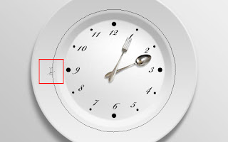
I decided to write out something like this:

The font I’m using is CAC Saxon This font is commercial also. Just try to use another one if you don’t have it. Ok, press Ctrl+H to hide round line for text. We are done on this step!
 Hope, this tutorial was useful for u! Thanks for reading it!
[Via Photoshopstar]
Thursday, May 27, 2010
//
Labels:
Photoshop Tutorials
//
0
comments
//
0 comments to "Photoshop Tutorials-Creating Unusual Advertising"


Post a Comment